Posts tagged technology
60 Tips in 60 Minutes

Thought Technologies

Equipment        

Technology Hygiene        

Law Practice Management        

Tools for Doing Law

Getting Better

Being Online        

Analog Technologies        

Week in Review: Banditry, Funerals, and a New Solo

Expect the Best, Plan for the Worst

Well, in two separate incidents on Wednesday and Wednesday night, Ben Carter Law had a laptop (mine) and TV (ours) stolen from our storefront. Huge bummer. But: we were able to erase the data on the computer remotely and restore from a recent backup when I got another computer on Thursday. I'm telling you this so that you can plan ahead so that a lost or stolen computer doesn't derail your practice. If you are in the Apple ecosystem, make sure your devices are signed up for the "Find My iPhone" service. This allowed me to lock and erase the stolen computer within minutes of its theft. It also allowed me to trace its location to one of two houses not far from our office. Second—and I can't stress this enough: keep recent backups in separate physical locations. I also use BackBlaze to backup to the cloud. An off-site backup and cloud backup: this is the "belt-and-suspenders" approach to backup that your data deserves. 

With a recent backup and cloud storage of our files, I lost no data and almost no momentum in what could otherwise have been a crushing loss. 

Needless to say, we're getting some extra security for the office. 

We actually have good information on who stole the computer. When things go missing around this time of year, I always point the finger first at these two. 

So, while I'm hopeful that we might recover the computer at some point, the TV is like dropping your keys into a river of molten lava. Man, it's gone. 

The courage to fix the things we can

The husband of one of my favorite clients of all time passed away this week. She texted to tell me the funeral arrangements, so I went. At the funeral, both she and her son expressed profound gratitude for our help in negotiating the the mortgage company an alternative to foreclosure. They explained that our help allowed their dad and husband to spend his final months in the comfort of his home and with the knowledge that the home was secure from the threat of foreclosure. 

At my firm, we are confronted daily with a lot of injustices and requests for help from a lot of people. This funeral was a much-needed flotation device in a swirling flood and was a reminder to me that it is not our job to fix every problem. It is only our job to fix the problems we can. Everything else is up to that higher power.

Peter Brackney goes solo

I was happy to learn this week that Peter Brackney has set up his own practice in Lexington. Peter is a great guy to follow on Twitter and will be working in the areas of consumer bankruptcy, business law, and estate planning. 

Do as Greg Belzley does

My friend and an attorney I admire a lot, Greg Belzley, was quoted in the Herald-Leader this week in a story about the state's failure to supervise the medical providers with which it contracts to provide care to Kentucky's prisoners. The situation is appalling and Greg is one of the leading advocates—inside and outside the courtroom—to change the callous, uncaring, inhumane treatment these human beings receive. 

Greg is a shining example of the good work a person of conscience can do when armed with a law license. We should all take a note. 

Use LibreOffice to Access .doc and .wpd Files on a Mac

As a Mac-using lawyer, I often have to solve the problem of how to work with legacy file formats. An awful lot of very good attorneys have done very good work using programs like Microsoft Word (.doc) and WordPerfect (.wpd). When these attorneys are kind enough to send me their pleadings and letters and research outlines in these formats, I use LibreOffice to open them on my Mac. 

From there, I can plagiarize the work of other, smarter attorneys into my new Pages document. (A few years ago, I switched from Word for the Mac to Pages due to stability issues.)

LibreOffice is a project of the The Document Foundation (which has created office productivity programs for spreadsheets and presentations, as well). If you download LibreOffice, I highly recommend you donate to support the Foundation (though I have tried twice in the past few weeks (so that I can practice what I preach here) only to have the process of donating fail...doh!).  

Technology for a Law Office: 60 Tips in 120 Minutes

Thought Technologies

Equipment        

Technology Hygiene        

Law Practice Management        

Tools for Doing Law

Getting Better

Being Online        

Analog Technologies        

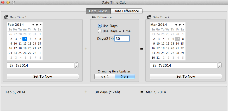
For Mac-Using Attorneys, "Date Time Calc 2" is a Useful App

We've all been there: you get a scheduling order from the Court and it contains approximately 854 deadlines, each one different and each one scheduled based on a number of days from either a) the date of the order itself or b) the date of the trial the Court has scheduled.

I use "Date Time Calc 2" to quickly perform date math for my cases. Actually, I use Date Time Calc, version 1, but when I went to write this post, I learned that the developer had just released a new version of the application. So, I guess it's more accurate to say, "I will be using Date Time Calc 2 to perform date math.

Never ballpark or count days on a calendar LIKE AN ANIMAL again. Let this app take the guesswork out of legal deadlines. 

Never ballpark or count days on a calendar LIKE AN ANIMAL again. Let this app take the guesswork out of legal deadlines. 

This is useful not just for quickly crunching court deadlines, but also in writing letters to other attorneys: "It has been __ days since I last sent you a settlement offer, so I thought I would write again to see if your client had had enough time to consider the offer." "The discovery is now __ days overdue."

I'm not going to belabor this post with a long explanation of how the app works. It's obvious how the application works: you click the date on one calendar, give it a number of days to count forwards from or back from, and it tells you on the other calendar what the second date is. It does one thing well—date math—which is all I need it to do. 

(For cost-conscious attorneys, the original Date Time Calc app is $2.99 instead of $4.99 for the newer 2.0 version. It is still available for purchase. As mentioned above, I am using the original, but plan on updating for two reasons: 1) the new version will get updates and bug fixes more often and 2) I don't mind spending money (especially when it's just a few bucks) supporting developers that make applications that help me get my work done quicker and more gracefully.)

Strides App is Helping this Kentucky Attorney Get Better

In an upcoming episode of Let's Start a Law Firm about law firm goals and "getting better", and “resolutions” for 2014, I talked about an iPhone app that I’ve been using to track some of my goals for 2014. (As an aside, you should really listen to the episode because Annie and I talk about how New Year’s Resolutions can be dangerous and cause more harm than the good they may or may not do.)

The app I’m using (after trying and buying about half a dozen) is called Strides (iTunes page)(developer site).

Before talking about the application itself, I think it’s important to explain the kinds of goals I’ve set for myself as a person and for my practice. I don’t resolve to “be more loving” or “be more contemplative”. I try to set goals that are measurable and will encourage me to get better over time. 

Here are my goals for 2014:

  • Exercise 200 times
  • Work from home 100 times
  • Write 52 blog posts for Ben Carter Law 
  • Sit quietly for 10 minutes 153 times
  • Collect $120,000
  • Work 12 weekends
  • File 10 bankruptcies
  • Visit a Kentucky State Park 8 times
  • Post 20 podcasts

Here is the crux of these goals: they are designed to encourage me to make lasting changes in the things I do each day. But, they are gentle enough and flexible enough that I don’t have to do any one of them every single day. Even though I don’t have kids or a real job and I could schedule a workout on Monday, Wednesday, and Friday of each week and a blog post each Monday morning and times for me to sit quietly on Tuesday, Thursday, and Sunday morning, that kind of structure has never been super-helpful to me. Inevitably, I miss one of those dates and I just start feeling bad. Feeling bad is not the point of trying to get better. The point is to get better.

I want my life to move in the direction of working out more often, writing more, filing more bankruptcies, and working from home more frequently. To do that, I'm encouraging myself into new patterns and new practices that will get me there. 

What I love about Strides app is that it allows me to set long-term goals and then track my progress towards that goal each day, week, or month. The best part about the app is that it tells me whether I’m ahead or behind of my long-term goal and allows me to adjust my behavior accordingly in the moment. If I’m behind, I haven’t failed. I just need to work to generate more bankruptcy work for myself, schedule a trip to a state park, or go work out.

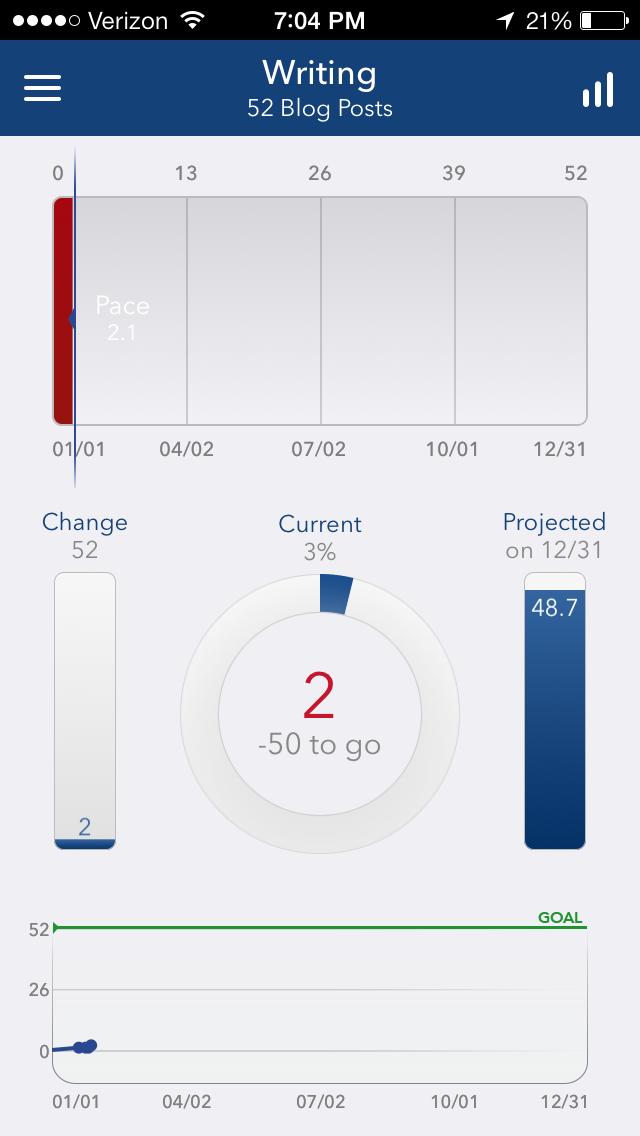
Here’s what some of my goals look like right now. You can see from my “Home Work” goal that the 6 times I’ve worked from home so far puts me pretty far ahead of the 3.8 times that would put me on track to meet my goal. It also projects that on my current pace, I’ll work from home 156 times this year. GREAT!

photo 1.PNG
photo 1.PNG
photo 3.PNG

But, as you can see, I’ve only posted two blog posts to Ben Carter Law, which puts me on pace to post 48.7 in 2014—4 short of the 52 I want to post. (Knowing I’m off-pace is one of the reasons I’m writing this right now.)

If you want to get better at something, think about setting a long-term goal that you can work towards now and using Strides to give you good feedback on whether you are on track to meet your goal. That’s it. It is a really good app. 

The rest of this post is a little bit more “in the weeds” about how the app itself works and how it could be improved. So, if that’s not your thing, I understand. (But, it does contain a useful tip for users from the developer...)

After using Strides for a few days, I was having some issues with updating the totals each day. I got some really helpful feedback from the developer. Here’s the exchange.

Hey Kyle,

Thank you for Strides. I'm an attorney and was looking for an app to help me meet some of my personal and professional goals in 2014 and your app provides the flexibility to track goals like "work out 200 times" and "bill 120K" and "work from home 100 days" and "write 52 blog posts". I've looked for other apps, but I think yours is the closest to how I want to structure and track my goals. I really appreciate the feature that lets me know whether I'm ahead or behind of year-long goals. This allows me the opportunity to modify current behavior to reach long-term goals. Awesome.

I have two suggestions. Please allow me to "check off" (add +1) to a goal just by hitting the number total in the goal summary page. In other words, instead of navigating to the tracking page, make the total number inside the circle a button that adds one to the numerical value in the circle. I think that would be a good function in and of itself, but I also want this feature because I'm having a really hard time getting the "add to total" toggle button working correctly. Each night for the past five nights, I've gone in to update my totals and the button seems to perform differently (erratically). One night, the toggle will be to "on" and I'll add "1" and it will reset my total to "1" for the year. Another night, I'll toggle it to "off" and change the number from 4 to 5 and it will add 4 and 5 to give me 9. It's sort of maddening and the one downer to the app right now. It's especially frustrating because it's so close to being exactly what I'm looking for!

Anyway, I've never written a developer with a feature request before, but know enough to know that you probably get a lot of requests and just hope you'll put this one on the list in its appropriate priority.

Many thanks, bc

And then the developer wrote me back:

Hi Ben,

Thanks for the feedback! I'm so glad to hear you're enjoying Strides.

We're working on a bunch of fixes to the Add to Total function for the next update. Sorry about that! It worked perfectly for all the beta testers, but we've found lots of little bugs that slipped through the cracks, so we'll get those fixed soon.

In the meantime, I would recommend turning Add to Total OFF and entering the new total, rather than the addition (e.g. 9 instead of 5) since the math is easy for this particular tracker.

I'll also think through the +1 idea from the circle chart. I totally get the value there, so I think we'll be able to do that in an update. Either way, we'll get Add to Total working correctly for you. :)

Thanks again for reaching out, and have a great day!

Kyle Richey

website: puresignal.co 

twitter: @puresignalapps

So, that’s awesome. And, the tip that he gave about turning "Add to Total OFF" for the time being and entering a new total is working for me. 

After using it for a couple more weeks, I have a couple more suggestion for future revisions. First, I would like the option to “snooze” recently updated goals. The app allows users to decide how frequently they want to review progress toward their goals. On many of these, I have a daily review scheduled at 6 p.m. because they’re things that I may have done that day: work from home, work out, write a blog post. Others, I only review once every few weeks (bankruptcies) or once a month (visits to state parks).

I would like a feature that allows me to not have to get a notification to review “work out” or “sit for 10 minutes” at 6 p.m. if I’ve updated that goal’s total within the last 24 hours. If I’ve updated the total, it’s because I worked out or sat earlier that day. The notification is just a hassle at that point. The point of the notification is to remind future you that “these are things that you might want to consider doing” and if I’ve already done that thing recently, I don’t want to review it.

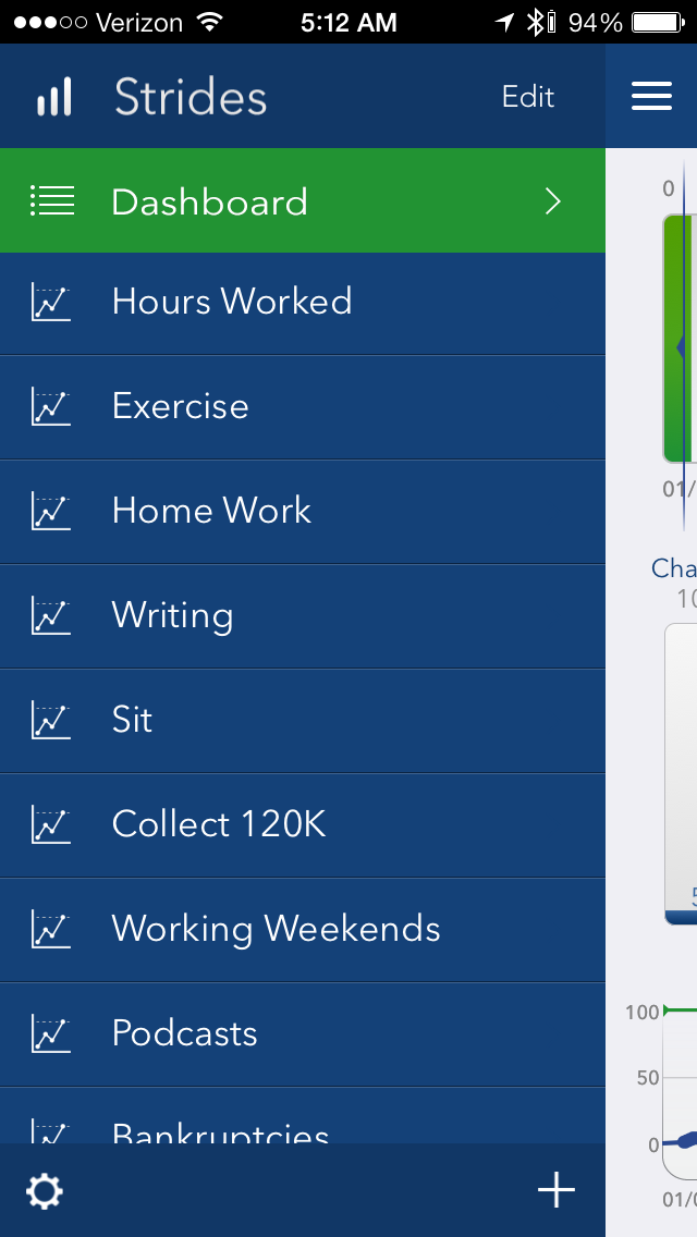
Related to reviewing goals, in the "menu" page (shown above), a right swipe gives the user the option to delete the goal. A left swipe in this view should take the user directly to the page on which they can update the goal's total, whether that's hours worked that day, calories consumed, or times the user sat quietly for ten minutes. 

These would be small usability improvements I’d like to see in an app that is really, really helping me a lot.

Budgeting for a Solo Law Firm: Or, How I Sleep at Night

I'm probably the last person you should be taking budgeting advice from. Turns out, majoring in English and going to law school didn't really do a lot to prepare me to run a business. (This is a bit of a misstatement. Truth is, majoring in English helped instill in me the values that I use every day to advocate for consumers against some of our country's most powerful industries. What I mean is that majoring in English and going to law school didn't really give me a whole lot of insight into the logistics and practicalities of starting and running a law firm.)

That being said, I want to share a spreadsheet with you that I've developed for my own practice and life that has helped me figure out exactly what I need to be making each month to survive as a business and person. Basically, it's a two-sheet workbook. The first is for determining my monthly business expenses and the second is my monthly personal expenses.   

I determine my monthly business expenses by totaling all the monthly expenses, totaling all the annual expenses, dividing my annual expenses by 12, and adding my monthly expenses and 1/12th of my annual business expenses together. 

Then, I carry that figure over to the second sheet of the workbook. The second sheet contains all of my personal monthly expenses. After totaling those expenses, I determine taxes by multiplying my personal monthly expenses by 1/3. (This is not a technically accurate measure of my tax liability. Technically, my tax liability will be on the net profits of my business, not the money I take to pay personal expenses. But, because at this point of my practice all net profits go to pay personal expenses, this is a "close enough" measure for me.)

Adding my monthly personal expenses and my tax liability gives me my "Personal Monthly Nut"—the amount of money I need to pay personal bills, my country, and my Commonwealth.  

I've carried over my "BCL Monthly Nut" from Sheet 1 of the workbook and add that to my "Personal Monthly Nut" to determine my "Great Big Monthly Nut"—the amount of money I need to make it all work. 

Finally, and this is what let's me sleep at night (or, keeps me up at night), I've calculated the amount of money I "Must Bill and Collect Each Day" to make my "Great Big Monthly Nut". I determined this amount by dividing 365 by 12 to get the average number of days a year and multiplying that number by 5/7 to allow myself two days each week of not billing anything. Ostensibly, that's to account for a weekend. This gives me 21.72 working days each month to work towards my "Great Big Monthly Nut". 

Knowing how much money I need to bill and collect  each day gives me one metric by which I can measure any given day. Sure, it's nice when a client calls and gives you good news. It's nice to talk with someone who says, "You're the only person who has called me back." Those are other metrics that I use to measure my day. But, if you're going to run a small business, you've got to be using the "Must Bill and Collect Each Day" metric, too. I can't pay rent with warm fuzzies and I can't pay court filing fees with good karma. 

You can view, download, and modify my budget to suit your purposes. I should say that mine is constantly changing as I grow, cut services, move offices, etc. The goal is not down-to-the-penny accuracy, but rather to give me a goal to work towards and to measure my performance against. 

Why I will not be renewing my Westlaw subscription in 2016...

Westlaw is, in my opinion, the best legal research software available. That's why I chose to buy a subscription from them. That's why I agreed to pay them $350 a month for the service. 

A few months ago, I moved offices to a place that offers Lexis to its tenants. That service is included in the price of my rent.  

I no longer needed Westlaw and would be content to use Lexis, which is a slightly less great product and save $350 a month. I asked Westlaw how much it would cost me to buy out the rest of my contract and they quoted me a figure that was more than $9,000. In other words, I could stop using Westlaw if I just paid for the rest of my three year contract up front. Instead of charging customers a reasonable early termination fee, they think that "every agreement made with West should be honored by both parties".

You know what I think? I think things change. And, I think companies ought to account for the fact that things change.  

I understand that the contract says what it says. I'm not disputing my obligation to pay under the contract. But, I also understand that I will only do business in the future with companies that understand that circumstances change and customers should be allowed to end contracts early for a reasonable early termination fee. So, I won't be renewing with Westlaw even though they offer the best legal research software because the terms under which they offer that software are unreasonable. And, because the tone of this letter is intolerably self-righteous.

So, attorneys who listen to my podcast or who read this blog, remember: just because a service may be the best, when it's combined with onerous or unreasonable terms and conditions, it can quickly become a poor option. It is an expensive lesson for me to learn. West could allow me to pay a reasonable early termination fee, but instead has insisted on continuing to provide me with a service I don't need. This short-sighted and greedy position will make them $9,000 over the next three years but won't make them a dime more.

Fortunately for me, in 2016 I expect the market for legal research options to be extremely competitive with Lexis, Fastcase, and CaseMaker all improving quickly. In my opinion, West should be concentrating not only on continuing to create a great service, but improve their product by pairing that product with humane terms and conditions that would foster customer loyalty. With the market of legal research options only getting more competitive, customer loyalty is going to matter a lot more than West currently appreciates.

Perhaps West's willingness to forgo customer satisfaction in favor of short-term profits reveals just how competitive the market has become for a company that used to enjoy a monopoly on the legal research world...

Kentucky Attorneys: Time to Get a Website

My client comes into my office after having been served by the Sheriff with a Complaint. Or, I file a Complaint for a client and then get an Answer back from the Defendant's attorney. The first thing I do in either situation is try to learn a little bit about the attorney representing the other side. I go to Google. I type in the attorney's name and the city and state in which they practice.  

Many times (and all-too-often), I get a page of results from sites like yellowpages.com, manta.com, topix.com, merchantcircle.com, and switchboard.com. That is to say, I get a bunch of garbage. 

I am consistently shocked at how little Kentucky attorneys seem to care about how they look online. I understand some established attorneys don't need  a website to get clients. But, even if you're not looking to find clients online, people (other attorneys) are still searching for you online. And, we're judging you. We're sizing you up.

I use the care you put into your website as a rough analog for how much care you're going to put into your client's case. If you don't care enough to have at least a homepage to present to the world, how hard are you going to research that response to my Motion for Summary Judgment? How hard are you going to think about the discovery requests you send? 

Is it a perfect test to use for sizing up my opposition? Nope. There are certainly some attorneys who have whipped me pretty hard who have abysmal or nonexistent websites. But, it works more often than not.  

Look, if your litigation strategy is inspired by Muhammad Ali's Rope-a-Dope, well congratulations: it's working. When you don't have a website, I'm totally underestimating your devotion to your craft and the care you bring to it. 

I'm guessing that judging attorneys by their websites didn't used to be as useful or accurate as it is today. But, that's because it used to be hard to have a website. Now, it couldn't be easier (or less expensive). The fact that it's 2013 and you still don't have a website is inexcusable. My site is hosted on Squarespace.com. I pay Squarespace $8 a month for this site.

EIGHT DOLLARS. 

If you want help getting set up on Squarespace, let me know. I have helped other attorneys and can help you individually. Or, if enough people express interest, would consider doing like a half-day workshop to help lawyers launch their websites in a single morning. Individual help costs $1,500. The workshop would, I expect, cost around $400 and would happen on a Saturday morning.

Along with that azz, include the data

I heard a harrowing story last night of a young man who lost 38 weeks of photos and video from a cross-country road trip because his car was broken into in Fargo, North Dakota. All his data was on his computer, backed up to thumb drives that were also in his car (and also stolen).  

Can you feel that pain? He was making a film . 

Gone.  

I think there are two lessons here. First, don't go to Fargo. Second, while you are busy backing that azz up, include your data in that backup.  

When I get the dough, I'm going to use File Transporter. For now, I backup on external drives that I store off-site and Dropbox.  

Sidebar: I really love this excerpt from the Wikipedia article about "Back that Thang Up", the non-explicit version of "Back that Azz Up": 

"The song, an explicit exploration of the same themes as Sir Mix-a-Lot's "Baby Got Back..."

And, for your Thursday pleasure (and because this is how my brain works): an extremely white version of "Baby Got Back":

Bonnie "Prince" Billy and Deli Radio

If you weren't at Bonnie "Prince" Billy's show last night to benefit the Network Center for Community Change, well, lo siento. 

But, if you don't want to miss great live music in Louisville (or anywhere), here is a radio station I made on my buddy Howie Cockrill's smoking-good website, Deli Radio, of all the bands coming to Louisville in the next two weeks.  Happy Monday. 

DeliRadio allows you to create custom playlists based on location and genre(s) to find live music where you live (or—and I use this a lot—where you're traveling to). WELCOME TO THE FUTURE.  

Evernote gives lawyers a valuable archive for their legal research

As anyone who knows me knows, I am a bit of an information hoarder. I have backups of backups. I have scans of important or memorable documents and a fireproof safe for precious documents. 

One of the areas of my life that had consistently frustrated my hoarding habit was legal research until I discovered Evernote.

The problem with saving legal research is that it's difficult to create a useful taxonomy for the stuff. When saving cases, should I save it in a subfolder in the case I'm working on? That seems logical but then retrieving the case years later will require me to remember exactly what case I was working on when I came across "that one case that stood for [insert legal issue] proposition". 

If instead (or additionally), I opt to save it under the legal issue the case stands for, what should I do when the case stands for two important propositions? Kentucky attorneys will obviously know that Steelvest, Inc. v. Scansteel Service Center, Inc. gives us our summary judgment standard in state court. But, it also states that a breach of fiduciary duty is tantamount to fraud. As a consumer advocate, this is an important part of the case. Do I save Steelvest in three places: the client file, the research file on summary judgment, and the research file on breach of fiduciary duty?  

No.

I save it to Evernote by emailing it from my online research service using a special email address Evernote provides. When I email that case to Evernote, the .pdf is automatically OCR'd so that a later search for any word in the case will yield results. This means if I can just remember a snippet of language or even what judge decided the case or attorney argued the case, I can search in Evernote and find the case. (I also have a spotless .pdf that I can attach to motions and memoranda.)

Even better, though, than the automatic OCR is Evernote's organizational tools. Evernote gives users the option of placing notes in notebooks (folders) as well as tagging the notes. This means that I can email Steelvest to my Evernote account, save it to a client's notebook, and tag it with the tags "summary judgment" and "bofd" (my shorthand for "breach of fiduciary duty"). Later, I can retrieve that case in one of three ways: I can remember the client notebook the case is saved in, I can find the case by reviewing the cases that have a particular tag, or I can search for the case in the search window using words that are likely in the language of the case. 

Lawyer–Nerds should be very excited right now. And it gets better. Are you ready to have your mind blown?  Evernote gives you the ability to send a case to a notebook with certain tags in the subject line of the email you send to Evernote. They explain on their blog how this works:

In the subject line of your email, write the title of the note as you want it to appear in your account. In the same subject line, add one or both of the following:

Use @ for notebooks: Use an @ symbol followed by the name of your destination notebook Use # for tags: Use a # symbol followed by the tag or tags you wish to assign. You can have multiple tags just make sure each one starts with an # For example, Subject: Trip to Florida @travel #expense report

Would create a note titled Trip to Florida in my travel notebook, tagged with expense report.

So, in one step, I am able to put a filed, tagged, OCR'd Steelvest into Evernote by emailing it to myself with this subject line: Steelvest @clientname #summary judgment #bofd

This is, to employ some fancy lawyer-speak, bonkers.

Any seasoned advocate will tell you that having a system that will allow you to accrete and retrieve your past legal research will yield wonderful benefits over the course of a legal career. I am totally invested in Evernote as that system because it allows me to easily and usefully create multiple taxonomies of meaning for my legal research. At $5 a month or $45 a year, the premium membership is a basic business expense that every lawyer should happily incur.

Lawyers, there are no SEO shortcuts

After I announced my willingness to help lawyers build better, more beautiful, easier-to-maintain websites, a few attorneys have asked me what they can do to increase their prominence on Google's search results. Many of them have the sense that SEO ("search engine optimization") is some magic dust that techies can sprinkle onto their website that will lift the site up into the first page of search results. (Of course, many have this sense because SEO "experts" market themselves as the 21st-century's dark magicians.)

Sorry, it doesn't work like that. 

Certainly, there are some best practices you can use when creating pages and titling blog posts that will help search engines determine whether what you're saying will be responsive to a particular query from a user. But, beyond a few very basic premises (which we'll be discussing at this summer's Commonwealth Justice Conference—sign up for email updates), the reality of increasing your prominence online is that you have to actually provide value to people. Gyi Tsakalakis explains this in a useful blog post. I particularly enjoyed his list of activities that real law firms engage in. 

So what kind of “stuff” do real law firms do? Here are some ideas:

Real law firms stand for something.
Real law firms are active in their communities.
Real law firms educate the public.
Real law firms inspire social change.
Real law firms help real people.
Real law firms partner with organizations that further justice.
Real law firms raise awareness of important social issues.
Real law firms maintain the dignity of the profession.
Real law firms participate in public service.
— Gyi Tsakalakis

The idea, folks, is that you start getting better results online only after you start achieving better results offline. Do something in the world worth telling people about and then tell them on your site. Or, do something online that brings people together in a new and unique way. Over time, documenting the real work that your law firm does and providing real value to your online community will naturally translate into better search results. But, this is important: you do the things not to get better search results but because the things are important to do. They're important to you, your clients, your community. Maybe the traffic from search results comes, maybe it doesn't. But, either way, you've done something worthwhile with your limited time and energy.  

I can work anywhere! Wait, that means I can work everywhere...
kcups.jpg

I am back in Ashland at my parent's place for Thanksgiving. I have been up since 5:30 cranking K-Cups in a quiet house and working on a contract for one of my clients, a great video production shop in Louisville.

One of the great aspects of lawyering in 2012 is that we can do it from most anywhere. My documents are securely stored in the cloud, my practice management software is available online, and I can do all of my research on the internet. This offers great freedom. 

Of course, it also means that I have done work while on a beach in Palau, from a coffee shop in New York, and a condo in South Carolina. I have responded to client emails from gas stations, during meals, and while sitting at red lights. (Do not text and drive, people. That's caveman-style levels of unsophistication.)

So, for my lawyer friends: how do you prevent the ability to work from anywhere from becoming the need to work from everywhere? What boundaries, if any, do you set up to separate yourself from work? 

Update to Typography for Lawyers Essay: When Ten Pages are Thirteen

My essay encouraging lawyers to adopt better typographical practices appeared today in The Advocate, the bimonthly publication of the Kentucky Justice Association

In it, I explain how making a few small changes to your letters, briefs, and presentations can make your words more beautiful and engaging on the page. I also explained that these changes may also help you fit more words on the page while staying within court-mandated rules governing type size, line length, and line spacing. 

One of the biggest changes comes from using true double spacing (set your line spacing to "Exactly" 24 points rather than Microsoft Word's default "Double Spacing" option (which is actually a bit taller than 24 points). 

Here, I've created a couple of documents that will show you the difference between the two approaches. I've created two separate documents so you can download them and compare side-by-side. Do that now.

Download the Appellant Brief sample
Download the Appellant Reply Brief sample

Here are some of the changes I made in the Reply Brief:

  • Used small caps for the section titles (Matthew Butterick's typeface, Equity, has beautiful small caps),
  • Removed ALL CAPS from the headings, opting instead for simple bold or italics,
  • Removed capital letters in headings
  • Used a table rather than a series of ........................... to denote a page number in the Statement of Points and Authorities (using a table also makes formatting way less of a hassle), 
  • Changed the typeface from Times New Roman to Equity (look at Equity's italic: beautiful)
  • Reduced the line spacing from Microsoft Word's default "double space" to true double spacing (set line spacing to "exactly" 24 points)

Here's the skinny: the Reply brief is more beautiful, it's easier to read, and therefore, more likely to be read. (Judges and their law clerks are looking for any reason—any reason—to stop reading. Even if that reason is the "blah" vibe that your brief is giving off. Sorry, it's true.) 

The Reply brief also fits more words onto the page. The "Argument" page in the Appellant Brief is 284 words long, including footnotes; the "Argument" page in the Reply Brief has 358 words. Reducing the line height to 24 points allowed me to fit 74 more words (26%) onto the first page of my brief. Multiply that by the ten pages allowed by the Court of Appeals for a Reply Brief, and I get 740 more words than an attorney using Microsoft's default double spacing. That's 3 extra pages of argument. That's a big advantage. 

If successful, our appeal will allow injured temporary workers to pursue lawsuits against temporary employers. Currently, these businesses enjoy both complete immunity and complete control over a temporary worker (whose workers' compensation benefits will be paid by their temporary employment agency). This encourages businesses to misuse and abuse temporary workers for the business's most dangerous work. A win would mean accountablity where there currently is none. That's a big deal. 

We all have cases that can yield big change if we win. I'm happy to have an additional three pages (when I need them) to explain to the Court why we should win.  

Typography for Lawyers: One Space, Double Spacing, and other Good Ideas

***Read an update to this essay (after reading this essay) that offers typography samples and actual words-per-page math. Thank you to Kentucky Justice Association for printing this in The Advocate***

This is an essay about typography.

What is typography? Basically, it’s how letters and words appear on the page, how individual words and chunks of text fit together. As lawyers, our livelihoods depend often on chunks of text. The thesis of this article is that small typographical improvements in your resumes, letters, briefs, and presentations can make a dramatic difference in your ability to effectively communicate and persuade.

Better typography improves your chances in mediations, in court, and in trial.

I need to make two points before I even get started. First, and perhaps already obviously, I am a nerd. How much of a nerd? I still own a 20-sided die. The best way to get me to corner you at a party is to mention in an offhanded way that you need to get a scanner (at which point, I will rhapsodize about the Fujitsu Scansnap 1500 for 20 minutes as the ice melts in your cocktail). As you will see, I’m the kind of nerd who can’t resist making a reference to Weird Al Yankovich’s cult classic UHF even in an article in which I hope to impress my peers.

I’m the kind of nerd that says, “Hell, yes!” when I discover that some typeface-designer-turned-lawyer has written a book about typography and the practice of law.[1] This is my second point: almost everything I have learned about typography I learned from Matthew Butterick and his excellent website, http://typographyforlawyers.com and book, Typography for Lawyers. Butterick is a Harvard-trained typeface designer and a graduate of UCLA's law school. So, he’s kind of in his wheelhouse on the subject of typography for lawyers.

I recognize that not everyone has attained the same nerd heights as me and may not want to read an entire book about typography. This is an attempt at a summary. Still, I highly recommend getting the book. I refer to it each time I write a brief. It contains great examples of before and after improvements to business cards, resumes, correspondence, and legal briefs. Further, it contains detail that can only be captured in a book; Butterick explains the proper use of em dashes and en dashes and hyphens, the nuances of non-breaking spaces and non-breaking hyphens, the dark art of letter spacing. So, get the book.

Plaintiffs attorneys would do well to adopt better typographical practices now rather than later. Law schools across the country are using Butterick’s book as part of their legal writing curriculum. The federal clerks who are reading your briefs will know the best typographical practices and will judge you and your failure to adopt them. Further, as I mentioned above, better typography produces briefs, letters, and exhibits that are easier to read and therefore more likely to be read and understood.

Plaintiffs attorneys have a brief window in which adopting better typography will provide us with a subtle advantage. The defense bar will eventually adopt better typographical practices and then our failure to use them ourselves will disadvantage us and our clients.

So, let’s get started on improving our work product with better typography. I will begin with some practices that will improve all of your documents, including your briefs, and then discuss the impact of court rules regarding margins and line spacing in briefs.

Use One Space after Punctuation

Modern typographical best practices flow from an appreciation of a fact that has eluded many attorneys: we have computers now, not typewriters[2]. We learned to type (or our typing teachers learned to type) on typewriters that used a monospace font. That is, every letter, whether it’s a fat “m” or a skinny “i”, was stamped on a piece of metal that was the same width as all the other characters. Using two spaces after punctuation in a monospace font is acceptable (but even there, unnecessary). On computers, however, we are blessed with proportional fonts–fonts with varying letter widths. Using two spaces after a proportional font is a vestige of our days from the typewriter. It is, as Butterick says, “an obsolete habit”. As he says in his book and website:

Some top­ics in this book will involve dis­cre­tionary choices. Not this one. Always put exactly one space between sen­tences. Or more gen­er­ally: put exactly one space after any punc­tu­a­tion.

One space. Period.

Okay, with that sacred cow slaughtered, let’s move on…

Use Bold or Italic Type for Emphasis

Do not use underlining. Again, underlining is a vestige from our typewriter days when there simply was no other option but to use underlining to add emphasis. Bold type and italic type just weren’t available on typewriters. Bold and italic type are the typographical equivalent of the electronic unlocking mechanism on your car. When was the last time you actually unlocked your car with your key?

Use better tools: bold and italic typefaces are more elegant and less disruptive to the eye than underlined text.

Justify Your Text on the Left

There’s really not much to this rule except to say that studies have shown that left-justified text is easier to read than text that is justified on both sides. In a left-justified document, the reader’s eyes use the nonuniform breaks along the right side of the page as a subtle guide to find the beginning of the next line of text.

Unlike the two previous rules, you do not have to stop justifying your text on both sides if you don’t want to. Know that you are making your reader’s job more difficult, but justifying on both margins is still acceptable practice. If you justify on both sides, however, you are required to turn on hyphenation in your word processor. Hyphenation will help you avoid the unsightly gaps in text that can occur in documents justified on both sides. These gaps, like the double spaces after periods, are little tiny speed bumps for the reader’s eyes as they travel across the page.

Look, I should probably be explicit about this now that I’ve used the phrase “little tiny speed bumps for your reader’s eyes”: I write my briefs with the understanding that judges and their law clerks are drinking from the fire hose. Like little Joe Miller in UHF, judges and law clerks found the marble in the oatmeal and now their reward is to read tens of thousands of pages of lawyers’ briefs each year. My baseline assumption about my audience is that they are drowning and are looking for basically any reason to stop reading my brief. Given this assumption, a lot of “little tiny speed bumps” in my brief are a really big problem for me.

Use a Nice Font

Fonts are what most people think of when they hear the word “ typography”. I hope my ranting so far has given you a sense that fonts (technically, typefaces) are just a small element of good typography.

Consider investing in a nice font. Butterick has designed a typeface, Equity, to meet the special needs of attorneys. It is polished, tight, and its italic is beautiful. Seriously, I find myself trying to find reasons to italicize words when writing with Equity. It’s available for purchase on his website. He also has recommendations for replacements for your Times New Roman and other common system fonts that are preinstalled on your computer and make your work look like everyone else’s work.

Avoid All Caps

Many attorneys rely on ALL CAPS as a way to emphasize their most important points and in the headings of their briefs. This is not a useful practice. ALL CAPS IS ACTUALLY HARDER TO READ than regular text. Butterick allows for a single line of all caps text, but no more. Personally, I try to avoid it whenever possible.

A BOLDED, UNDERLINED, ALL CAPS HEADING is just an invitation to your reader to skip past it.

On a related note, if you have a case which involves the question of whether a provision in a contract is clear and conspicuous, Butterick is available to serve as an expert witness. I think his services would be especially useful in consumer cases which involve contracts that contain paragraph upon paragraph upon paragraph of all caps text. The science is in: this text is difficult to read.


Every court promulgates rules regarding typography. These rules are designed to promote fairness, uniformity, and legibility by forbidding attorneys from engaging in the worst typographical practices in an effort to squeeze more words onto a page. These rules have their most dramatic impact on line length (margin rules) and line spacing (the requirement that the lines be double-spaced).

Shorten Your Lines Outside of Briefs

“Shorter lines are easier to read than longer lines,” says Butterick. Ideally, your line will be between 45 and 90 characters, including spaces. Most courts in Kentucky require one-inch margins on both the left and right. (The appellate courts require 1 1/2" margins on the left.) At these margins, your 12-pt Times New Roman line is going to have more characters than the recommended maximum of ninety. Outside of lobbying for a rule change, there’s nothing you can do.

Move on to something you can fix: your line lengths in your letters, interoffice memorandum, and presentations. For me, shortening my line lengths was a revelation; this small change led to an immediate improvement in the look and readability of my letters.

Use True Double Spacing for Better Briefs

The ideal line spacing is 120–145% of your font size. That is, if you are using a 12-point font, you should set your line spacing between 14.4 and 17.4. Personally, for my out-of-court documents, I use 15-point spacing. It provides a little more space between the lines than the “single spacing” setting (which makes words look cramped and is difficult to read).

Most courts require us to double space our briefs.[3] CR 76.12(4)(a)(ii) requires us to use “black type no smaller than 12 point” and typing that is “double spaced and clearly readable.” The court’s requirement to double space your briefs does not mean, however, that you just go into Microsoft Word and pound the “double space” button. True double spacing for a 12-point font means setting your line spacing at “Exactly” 24 points. Using Microsoft Word’s default “double space” will give you line spacing greater than 24 points–about 15% greater, in fact. This translates to having 2–3 fewer lines on a 8 1/2“ x 11” page.

In other words, if you are using Microsoft Word’s default “double space” setting for your pleadings, you are hurting yourself in two ways: 1) you are making your document less legible by putting more space than ideal between your lines and 2) you are making your document longer than it needs to be. Because our courts set maximum page limits (rather than word limits), this means you are giving yourself (and your client) fewer words to explain your position than you would otherwise have available to you.

How many times have you been on page twenty-six and need to slim a brief down to twenty-five pages? True double spacing will give you more words and those words will look better on the page.

There: I just gave you a way to be more verbose than you already are. For that and for all the other typographical wisdom (cribbed entirely from Matthew Butterick), you’re welcome.

Sometimes it pays to know nerds.


  1. The only other lawyer I knew personally that had read Typography for Lawyers and cared about this stuff at all was Finis Price. I miss that guy.   ↩

  2. For anyone reading this still using a typewriter: you need help this article cannot provide. Please stop reading.   ↩

  3. I’ve looked through Jefferson County’s local rules and can’t find a double-spacing requirement anywhere. Nonetheless, I think the court would look askance at anything not double-spaced.   ↩

Shooting Ourselves in the Feet with Bullets

We are out of control with our PowerPoints.  

As a group, lawyers are the worst presenters I know. As a group, lawyers should be the best. We make our livings telling stories to clients, judges, and juries. Yet, give us a Powerpoint and we will oppress an otherwise interesting and important story into a brutal deathmarch of text-laden slides worthy of the Jackson Administration. We read from our slides (which consist of the notes for our talk) until a woman in the audience begins to wish that the bullets on the screen were lodged somewhere in her prefrontal cortex.

It doesn’t have to be this way.

Never has it been this easy to give[1] a great presentation. Whether you use Microsoft PowerPoint or Apple’s Keynote, either program can quickly incorporate interesting images that capture a key concept. You can find these images online and save them to your computer in an instant. The fonts available to us are limitless.[2] Beautiful templates are prepared for us and baked into the software.

Never has it been this hard to give a great presentation. I have been traveling the state with the Kentucky Law Update series to talk about our enduring foreclosure crisis. I present after lunch. When I walk in the room during the break, I see the half-finished crosswords. I see the Amazon Kindle’s poking out of purses, the iPads filled with games and email. I know what I’m up against. The demands on our audiences’ attention have never been greater.

It has never been harder to get and keep an audience’s attention. I am here to tell you a hard truth: your deep knowledge and compelling series of bullet-pointed slides that explain everything so obviously and logically is not enough. Not even close. If you want your audience’s attention, you are going to have to rip it out of their iPad’s cold, dead hands.[3]

For trial attorneys like me, our livelihood depends on our ability to give a good presentation. Having someone’s attention is a precondition to persuasion. But, even if you are never going to set foot in a courtroom, you still need to know how to give a good presentation. You still have a stake in helping us all become better presenters.

There are 17,000 members of the Kentucky Bar Association. Each of us are required to gather 12.5 hours of Continuing Legal Education credit each year. We comply by sitting through lots of presentations. Multiply our membership by a 25-year career and collectively we will endure about 5,312,000 hours of presentations before we retire.[4]

That’s a lot of crummy presentations.

There are some basic things we can do to make our presentations instantaneously less awful. First, do whatever you need to do to keep your audience’s attention. If the only way you can do this is by butchering a chicken while talking about subrogation rights or ERISA plans, bring a tarp to make cleanup easier. Let’s stop pretending this isn’t a show and that we’re not, in part, ringleaders.

Next, adhere to Guy Kawasaki’s 10–20–30 Rule. No more than 10 slides. No more than 20 minutes. Nothing less than 30-point font on your slide. Look, your slides shouldn’t be your notes.[5] Your notes are your notes. After you create your crappy presentation that just reflect the main things you want to say, hit “Print”. Those are your notes. Congratulations. Now create your presentation with 10 words–one per slide that capture your points. Better yet, pick ten pictures that enliven the concepts and entertain while you use your notes. Your slides should be in conversation with your words, not an echo of them.

Third, get curious about how to make your presentations better. Read Presentation Zen by Garr Reynolds or Beyond Bullet Points by Cliff Atkinson.

Finally, it’s time we start expecting more of ourselves and our colleagues than dry marches through case law and statutes. Obviously, imparting substantive knowledge needs to happen, but it’s time to stop pretending it’s our audience’s job to already be interested in our topics and it’s their fault if they don’t give us their undivided attention. Their failure to pay attention is our failure to capture it. Be brutal in evaluations. Demand more. If a presentation wasn’t great, give suggestions to make it better. If the presenter just phoned it in, say so.

Presentations matter. They matter to colleagues, clients, opposing counsel, and juries. At a minimum, five million hours of smart people’s time is at stake. Don’t let a bad presenter waste another hour of yours.

Ben Carter is an associate at Morris and Player, PLLC, a firm for plaintiffs. He is a consultant to the Network Center for Community Change on issues surrounding foreclosure, tax liens, and vacant and abandoned property. He welcomes your thoughts and ideas: bwc@morrisplayer.com.


  1. When I say “give”, I mean it: a great presentation is a performance that stays with the audience. It is a gift.  ↩

  2. Please, stop using Calibri. When I see Calibri on the screen, the words I see are, “default.” As in: “The fact that this presentation is awful is default of the presenter.”  ↩

  3. I am aware that iPad’s do not technically have hearts and that they are, in fact, cold and dead already. You do not need to email me on this point.  ↩

  4. This doesn’t include all the time we spend in internal firm meetings that resemble the eye-popping scene from A Clockwork Orange ↩

  5. When was the last time you went to a movie and the screen was bifurcated: one side with the action and actors and the other side with a scrolling script? Exactly. Time to raise your game.  ↩

*  *  *  *  *

The Kentucky Bar Association is kind enough to publish this in their March edition of Bench and Bar. I don't mean to imply in this article that I'm the world's best presenter—far from it. I still rely on bullet points and text too much in my own presentations. You can see it in a presentation I gave last fall. But, if you watch the video, you can also see in that presentation a lot of pictures to complement the ideas I'm talking about. Including a few Venn diagrams. Nothing wrong with a Venn diagram. 

Foreclosure Presentation: Loan Modifications and Foreclosure Mediation

The Network Center for Community Change pays me (yes, it is a great job) to train attorneys attorneys to defend homeowners facing foreclosure and work with courts to implement processes that ensure everyone is getting a fair shake during a foreclosure. This is a presentation from last fall at the Kentucky Bar Association's Kentucky Law Update in Covington, Kentucky in which I explain to attorneys how they can profitably incorporate foreclosure defense into their practice, how loan modifications work and don't work, and why the court system needs to change how it handles foreclosure proceedings. Somehow, I also talk about the Sausage of Justice.

Read more about the Network Center for Community Change: makechangetogether.org

If you would like for me to come to your area to give a talk, I'm available